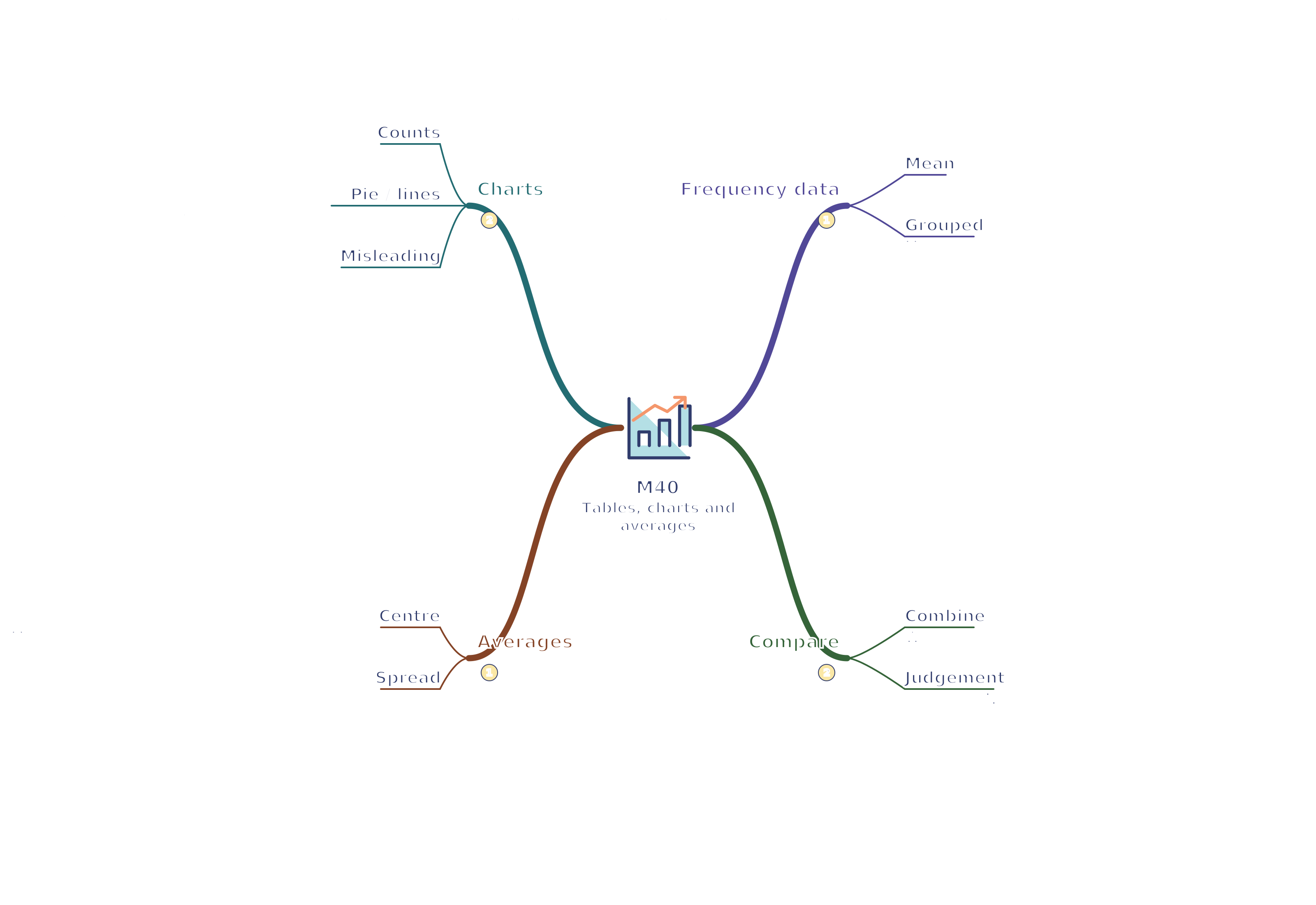
Revision notes, worked examples and methods for tables, charts and averages.
Notes and quizzes ready · 50 questions · Revision video ready.
Foundation shows shared notes and questions. Higher includes the shared content and labelled Higher extensions. Changing tier starts the notes and a new quiz set.
Revise the key ideas
Choosing tables and charts
Frequency is how often a value or category occurs. A frequency table should identify values/categories, counts and the total sample size.
Bar charts show categorical or discrete groups with equal-width separated bars; height represents frequency. Label axes and use a consistent scale. Separated bars for travel categories
A pictogram uses symbols for counts. State the key and use fractional symbols consistently; if one symbol means 4, a half-symbol represents 2.
A pie chart shows proportions of a total. Sector angle = category frequencytotal frequency × 360°. With 12 of 30 students, the sector is 144°.
A vertical-line chart represents ungrouped discrete numerical values. A time-series line graph connects measurements in time order; it is not the same as a scatter graph.
Look for misleading displays: truncated axes, unequal spacing, inconsistent symbol areas and omitted categories can exaggerate a difference.
Averages and spread
Mean = sum of valuesnumber of values. Median is the middle value after ordering; for an even count, average the two middle values. Mode is the most frequent value; a set may have no unique mode.
Range = largest value − smallest value. It describes spread, not the typical value, and is sensitive to extreme observations.
Worked example: For 2, 3, 3, 4, 8, the mean is 4, median 3, mode 3 and range 6. The high value 8 raises the mean more than the median.
Choose an average for the context. Median often describes a skewed set of incomes better than mean because a few very high incomes can pull the mean upwards.
Frequency tables and grouped data
For a frequency table, mean = ΣfxΣf, where x is a value and f is its frequency. Multiply each value by its frequency before adding. Σ means “sum of”.
For continuous grouped data, use each class midpoint as its representative value. The resulting mean is an estimate because exact individual values are unknown.
Worked example: Classes 0 ≤ x < 10, 10 ≤ x < 20 and 20 ≤ x < 30 have frequencies 2, 5, 3. Midpoints 5, 15, 25 give estimated mean 10 + 75 + 7510 = 16.
The modal class has the greatest frequency. Use cumulative totals to locate the class containing the median; grouped tables alone do not give an exact median value.
When combining groups, add their totals and counts, not simply their means. Two people averaging 10 and eight people averaging 20 have combined mean 2 × 10 + 8 × 2010 = 18.
Explain comparisons using both average and spread. Check sample sizes, outliers and whether the groups were measured consistently before drawing a conclusion.
Test yourself
50 questions · Sets of 10 from the selected tier. For fractions, use / when typing; for powers, use superscripts or ^. Follow each question's answer format. These quick checks support revision; practise full written solutions and proofs too.
Watch M40 · Tables, charts and averages
Revise tables, charts and averages with this narrated video. Use the player controls to pause, seek, adjust the volume or mute. Turn English captions on or off using the captions menu.
 Mr Kidman's Classroom